Retrospec Rebrand
Retrospec Rebrand
Retrospec Rebrand
Retrospec Rebrand
Retrospec Rebrand
From its inception in 2009, Retrospec has been synonymous with the Los Angeles fixie scene. With a rapidly growing catalog of outdoor products, it was time for its identity to better reflect its offering & audience. The new identity emphasizes a "no barrier to entry" & an environmentally conscious approach to the outdoors. We focused on offering well-designed products at an everyday price and getting more people outdoors at an accessible price.
From its inception in 2009, Retrospec has been synonymous with the Los Angeles fixie scene. With a rapidly growing catalog of outdoor products, it was time for its identity to better reflect it's offering & audience. The new identity emphasizes a "no barrier to entry" & an environmentally conscious approach to the outdoors. We focused on offering well-designed products an everyday price, getting more people outdoors, with a clean conscience, for a fair price.
From its inception in 2009, Retrospec has been synonymous with the Los Angeles fixie scene. With a rapidly growing catalog of outdoor products, it was time for its identity to better reflect it's offering & audience. The new identity emphasizes a "no barrier to entry" & an environmentally conscious approach to the outdoors. We focused on offering well-designed products an everyday price, getting more people outdoors, with a clean conscience, for a fair price.
From its inception in 2009, Retrospec has been synonymous with the Los Angeles fixie scene. With a rapidly growing catalog of outdoor products, it was time for its identity to better reflect it's offering & audience. The new identity emphasizes a "no barrier to entry" & an environmentally conscious approach to the outdoors. We focused on offering well-designed products an everyday price, getting more people outdoors, with a clean conscience, for a fair price.
From its inception in 2009, Retrospec has been synonymous with the Los Angeles fixie scene. With a rapidly growing catalog of outdoor products, it was time for its identity to better reflect it's offering & audience. The new identity emphasizes a "no barrier to entry" & an environmentally conscious approach to the outdoors. We focused on offering well-designed products an everyday price, getting more people outdoors, with a clean conscience, for a fair price.
Brand
Brand
Brand
Brand
Brand
Retrospec
Retrospec
Retrospec
Retrospec
Retrospec
Role
Brand
Role
Role
Role
Art Direction, Identity Design, Visual Design
Art Direction, Visual Design Lead
Art Direction, Visual Design Lead
Art Direction, Visual Design Lead
Art Direction, Visual Design Lead
Year
Year
Year
Year
Year
2017 - 2019
2017 - 2019
2017 - 2019
2017 - 2019
2017 - 2019
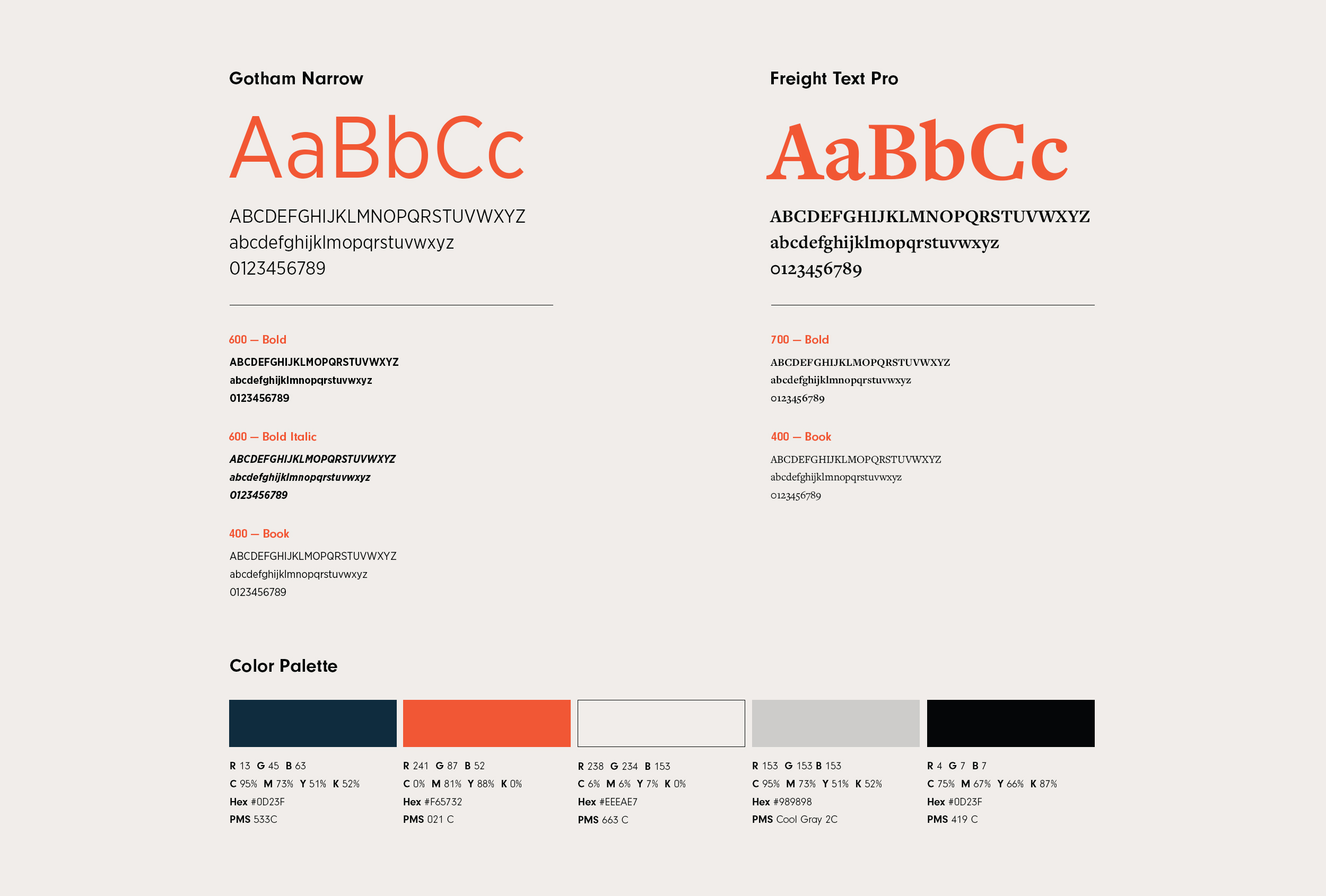
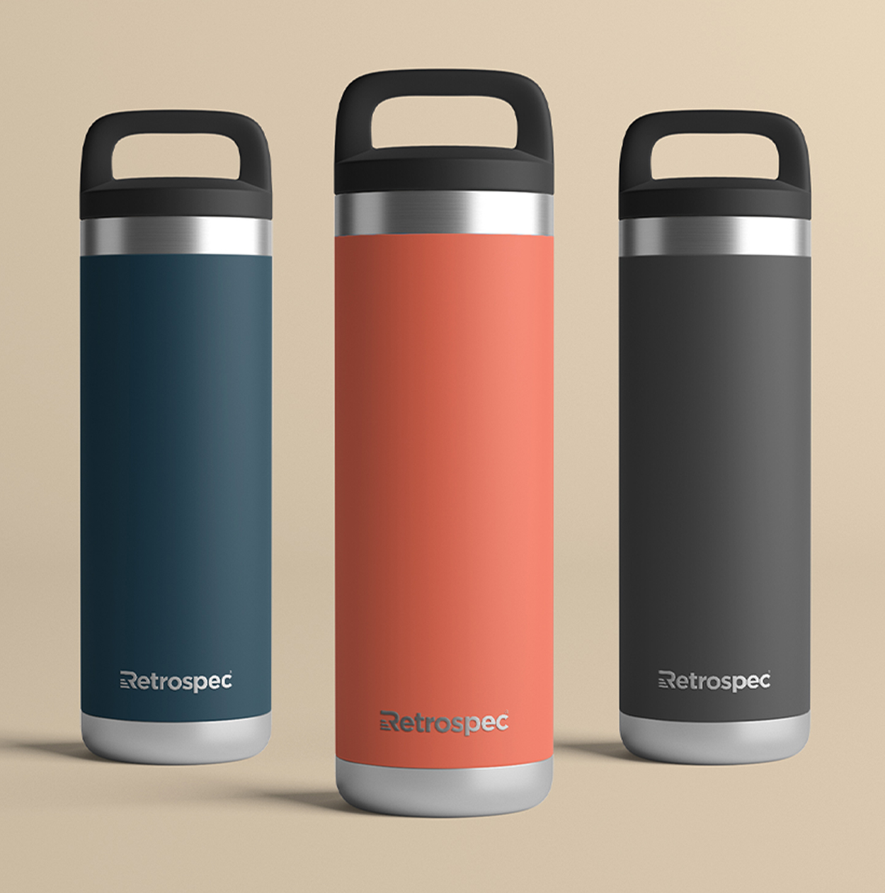
Typography & Color
Typography & Color
Typography & Color
Typography & Color
Typography & Color
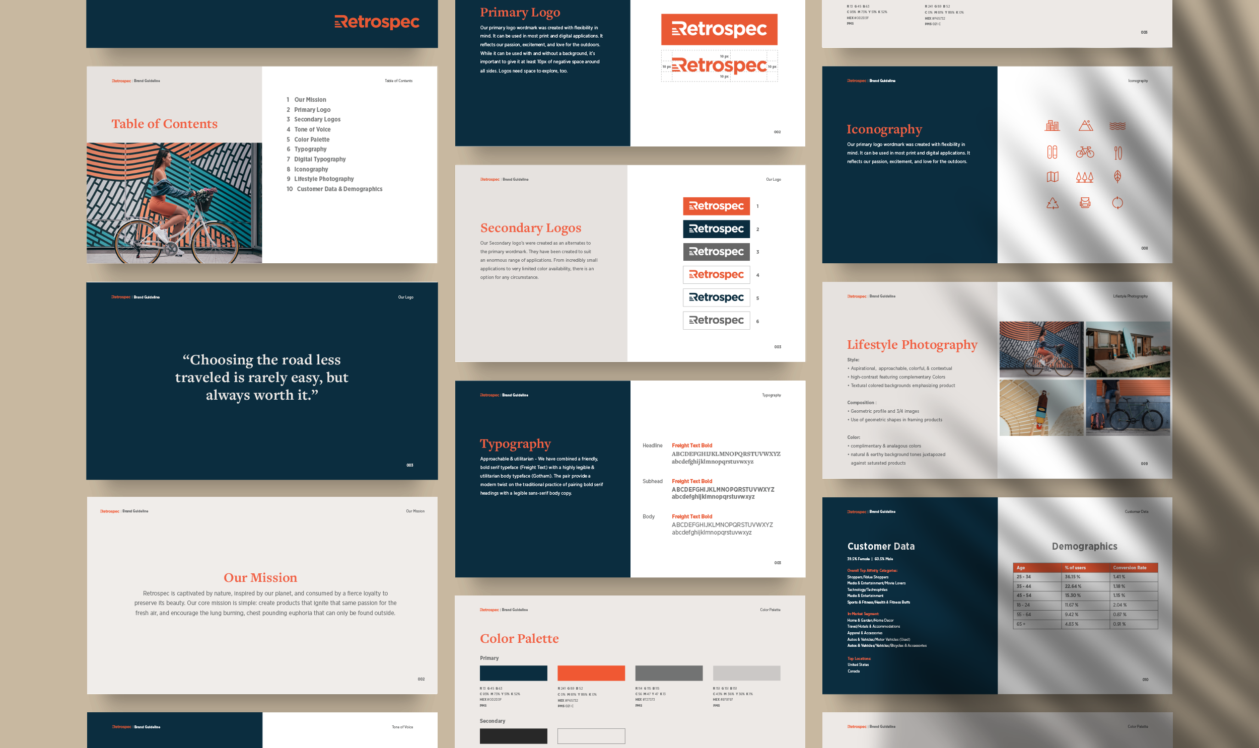
Refined, Vibrant, Approachable - a warm, rich, and classic color palette complemented by a stylish & legible sans-serif typeface. The pair reflect a modern twist on a timeless technology.
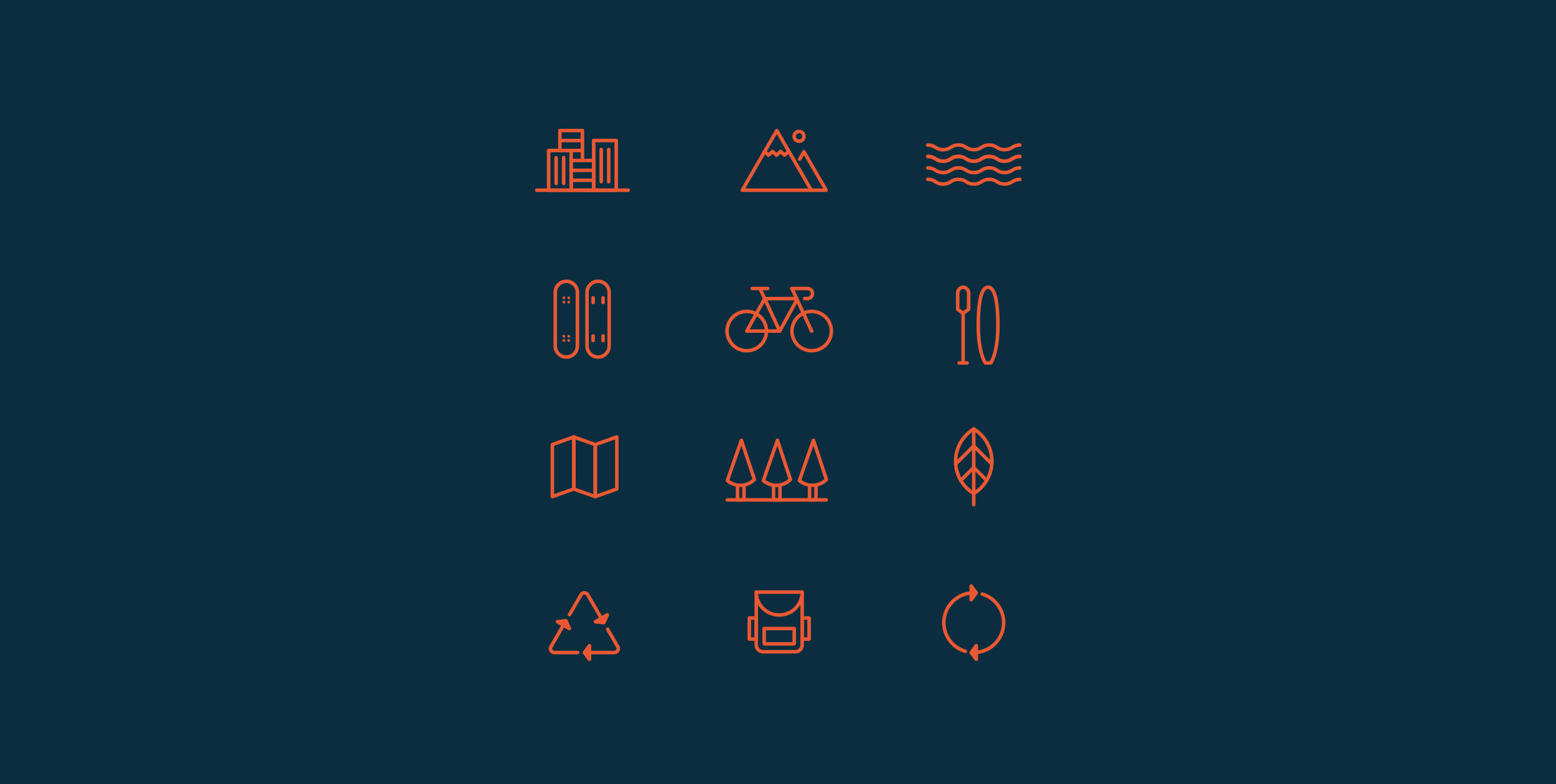
Iconography
Iconography
Iconography
Iconography
Iconography
I designed a series of playful outdoor-centric icons with the goal of differentiating product categories. Additional icon sets were created with the purpose of identifying environmental initiatives & related value propositions.
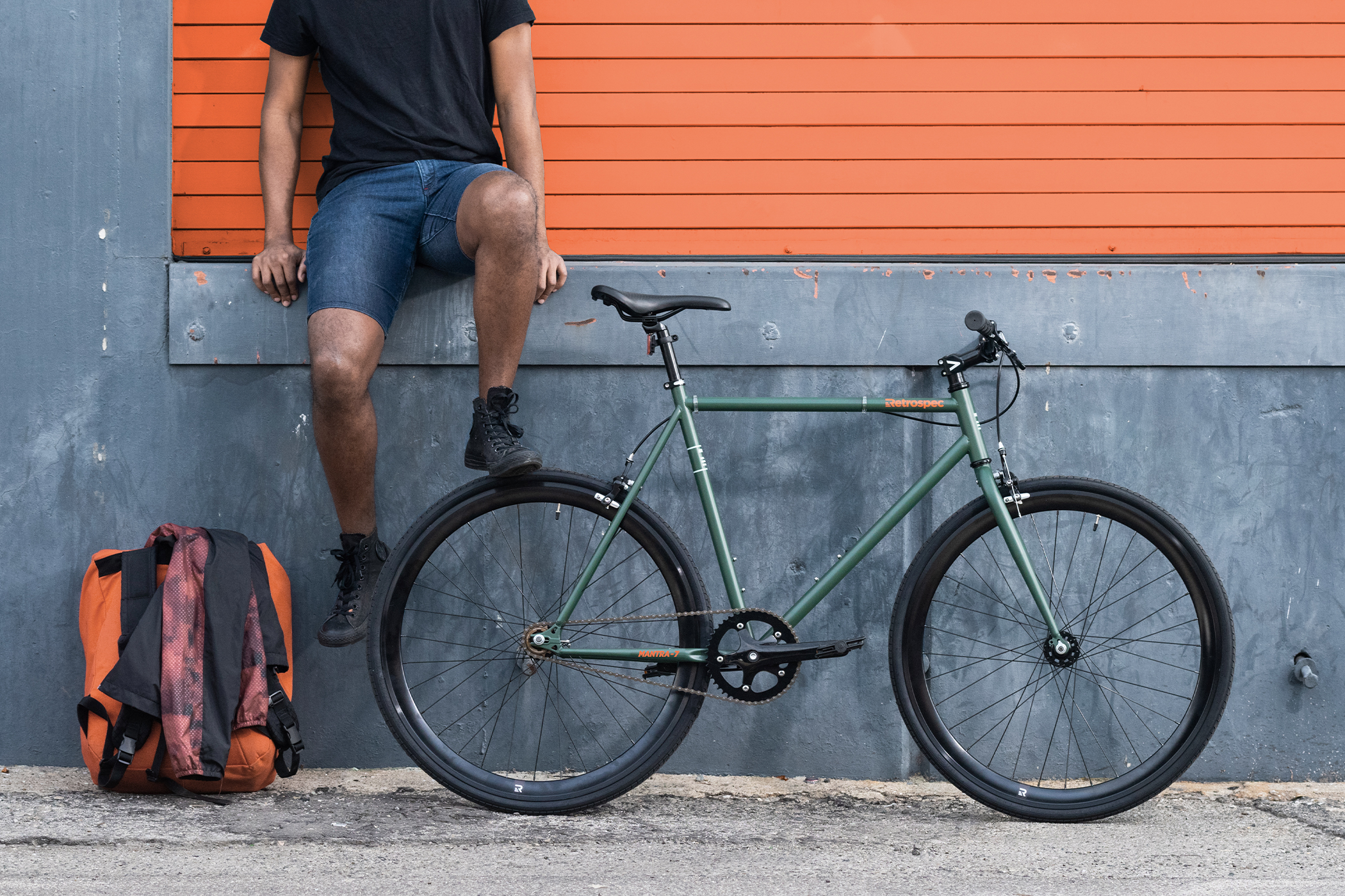
Lifestyle Photography & Styling
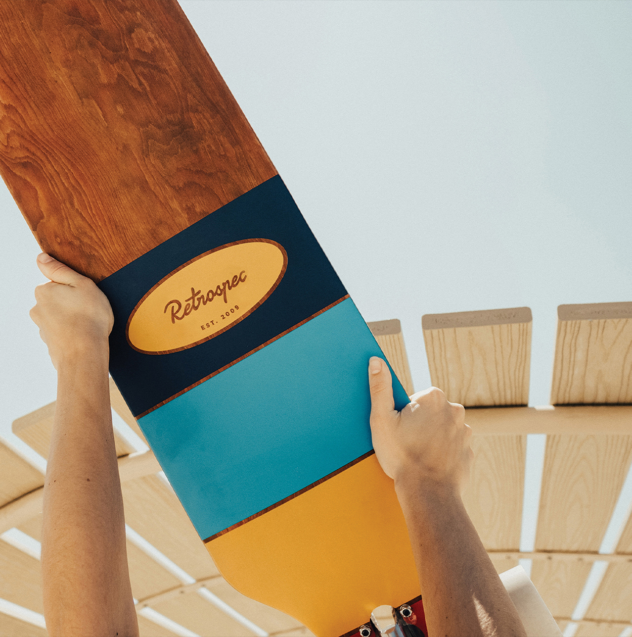
Product Photography & Styling
Product Photography & Styling
Product Photography & Styling
Product Photography & Styling
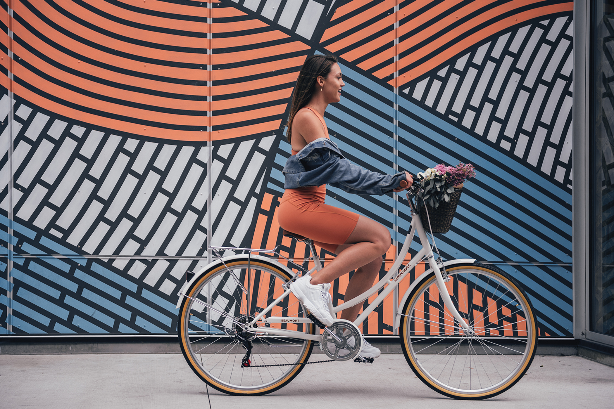
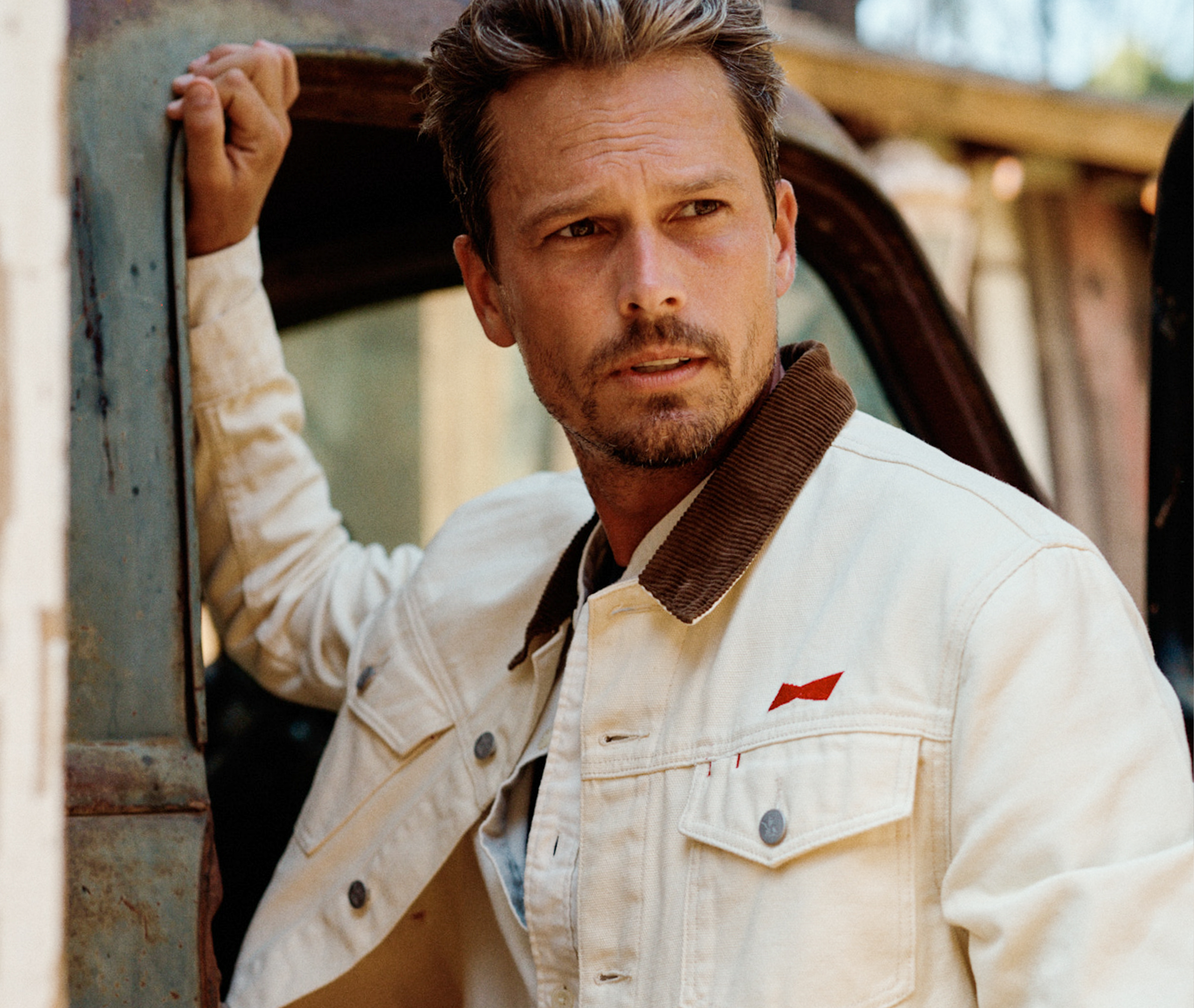
Retrospec's lifestyle imagery is vibrant, modern & aspirational - focusing on the overall design & silhouette of individual products depicted. Images are saturated, high-contrast, geometric & encourage customers to get outdoors.
Ecommerce Experience
User Interface
User Experience
User Experience
User Experience
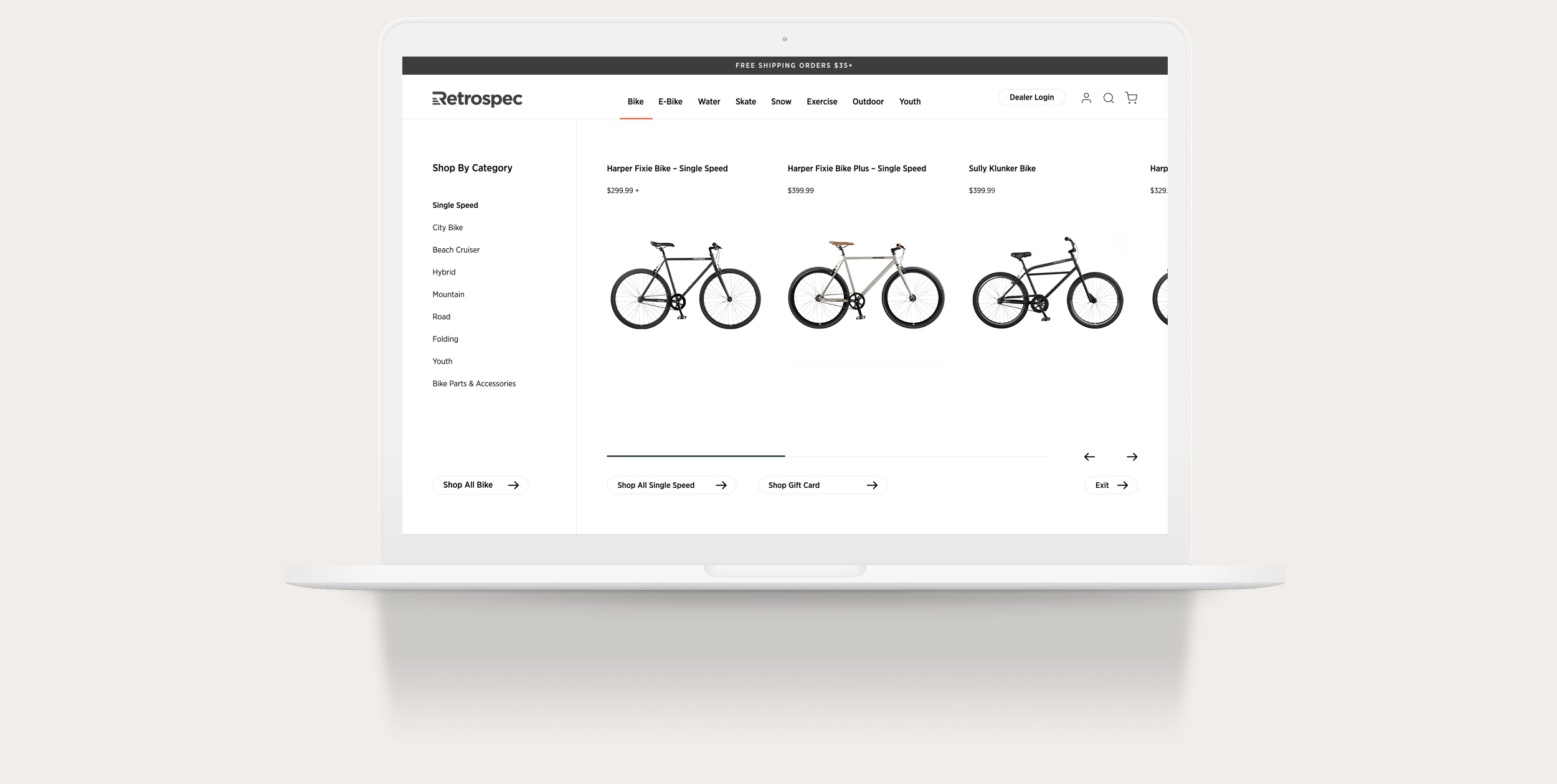
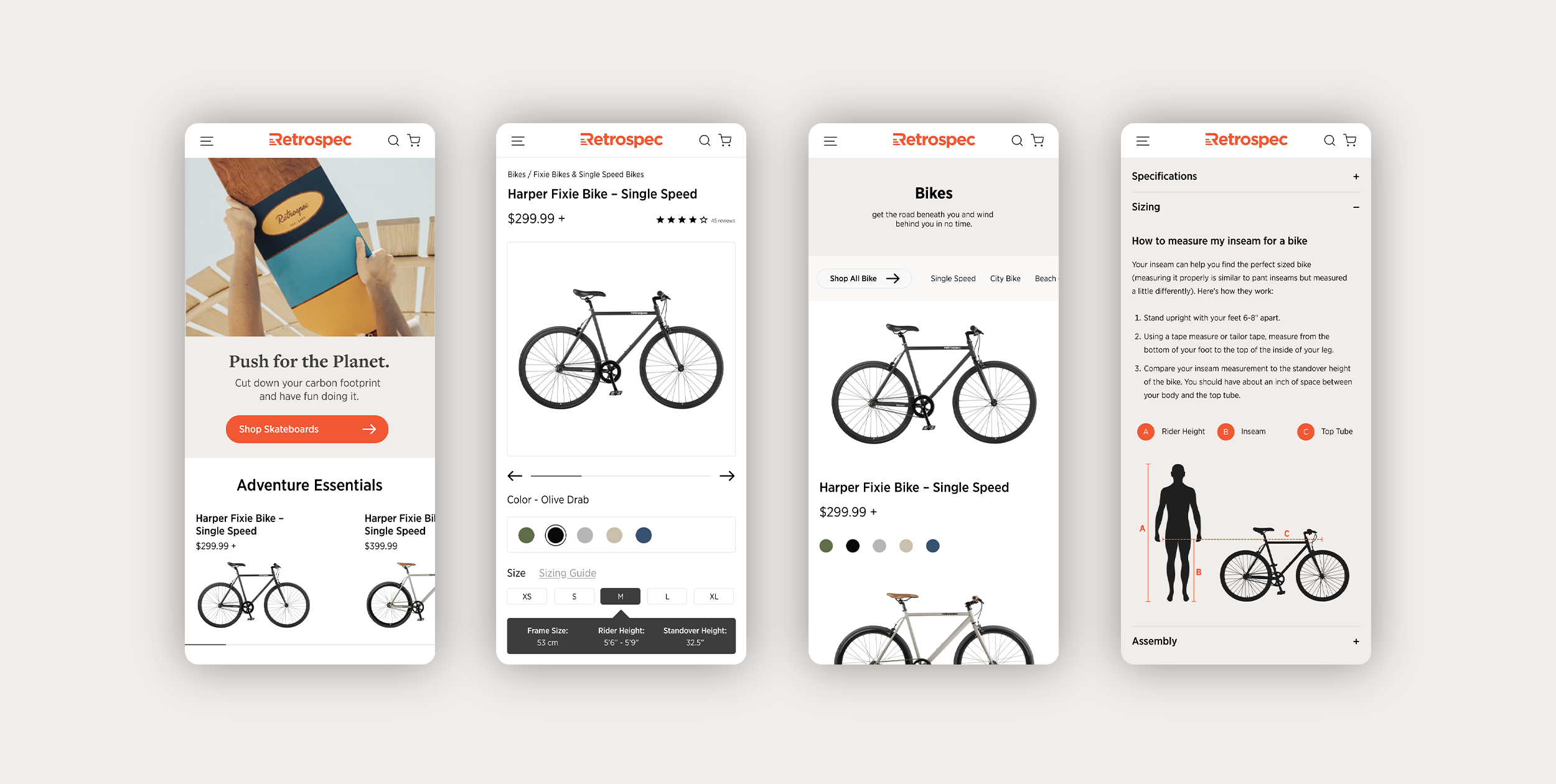
As a brand focused on eliminating the barriers to the outdoors, it was our top priority to educate users throughout the user experience. Image-based navigation allowed users to gain a fundamental understanding of differentiating factors between similar products without extensive previous knowledge. Other key educational features included sizing help guides upon checkout, checkout diagrams, product descriptions, product specifications, and sizing carousels.
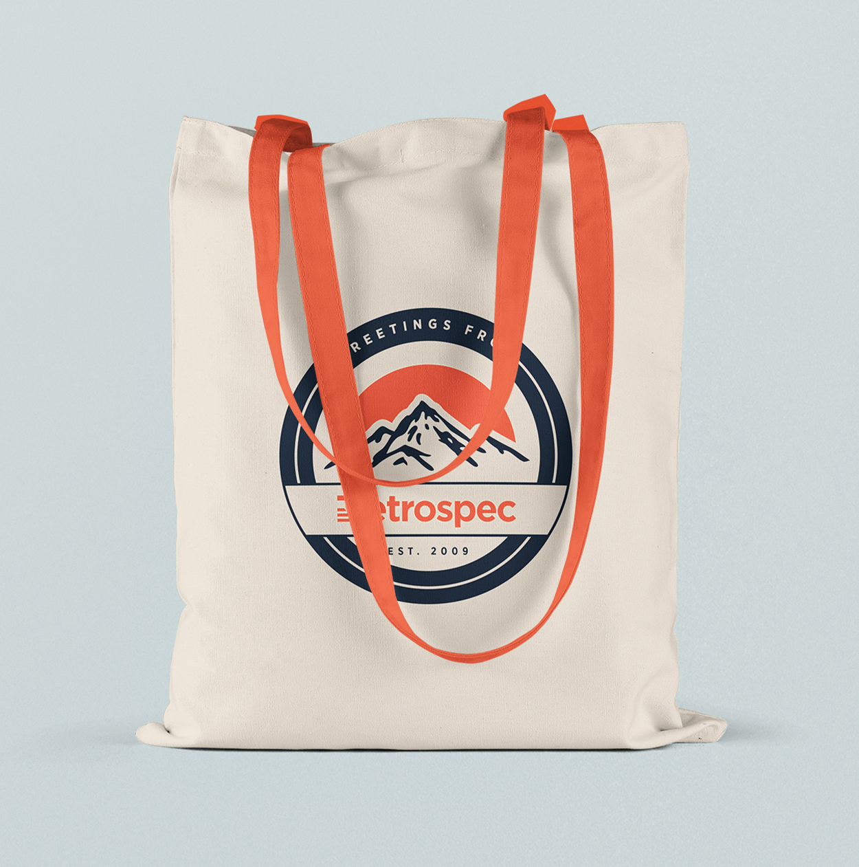
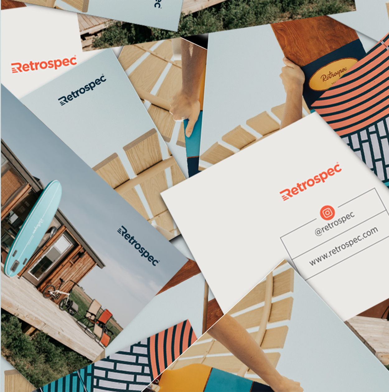
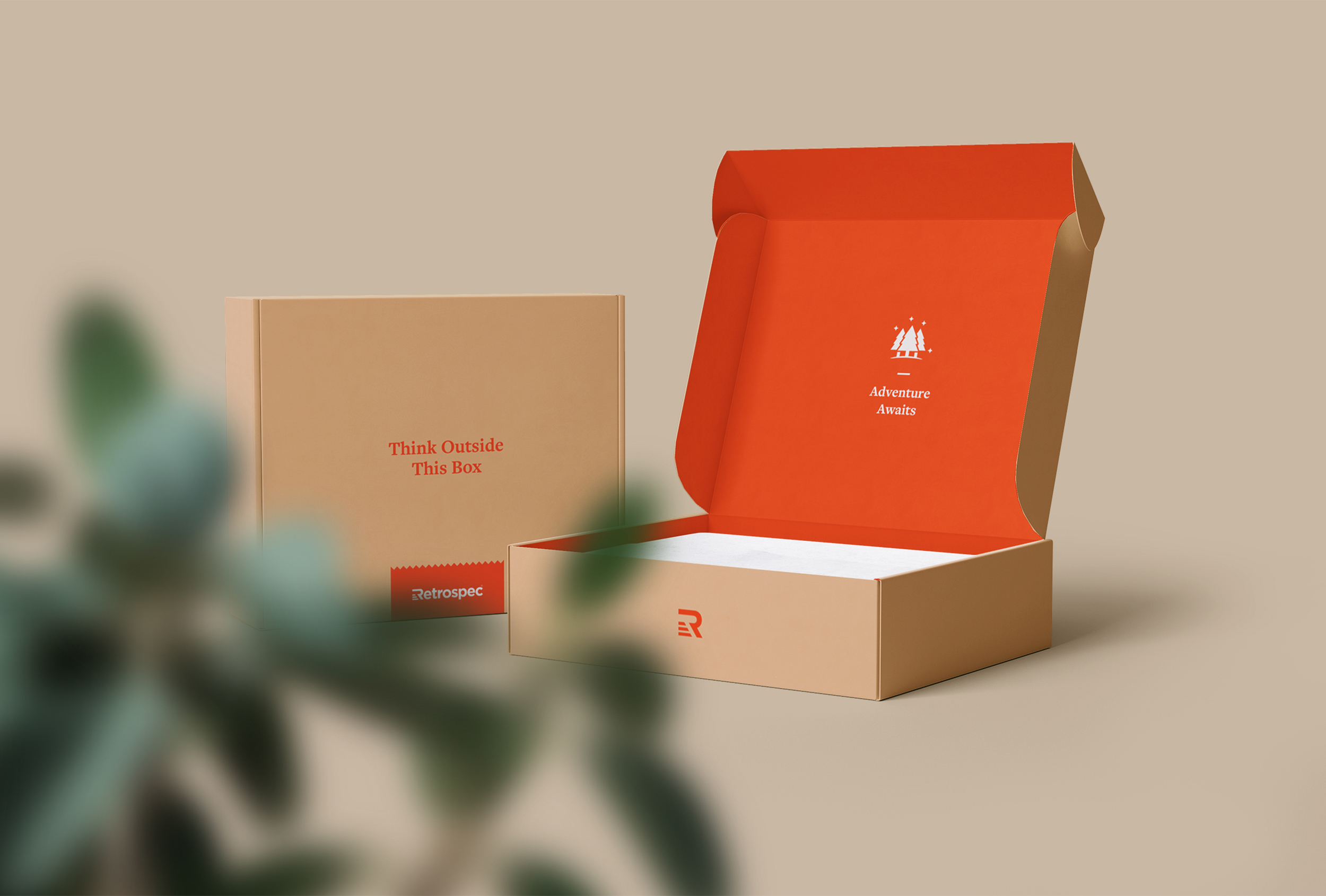
Print & Packaging
Print & packaging
Print & packaging
Print & packaging
Print & packaging
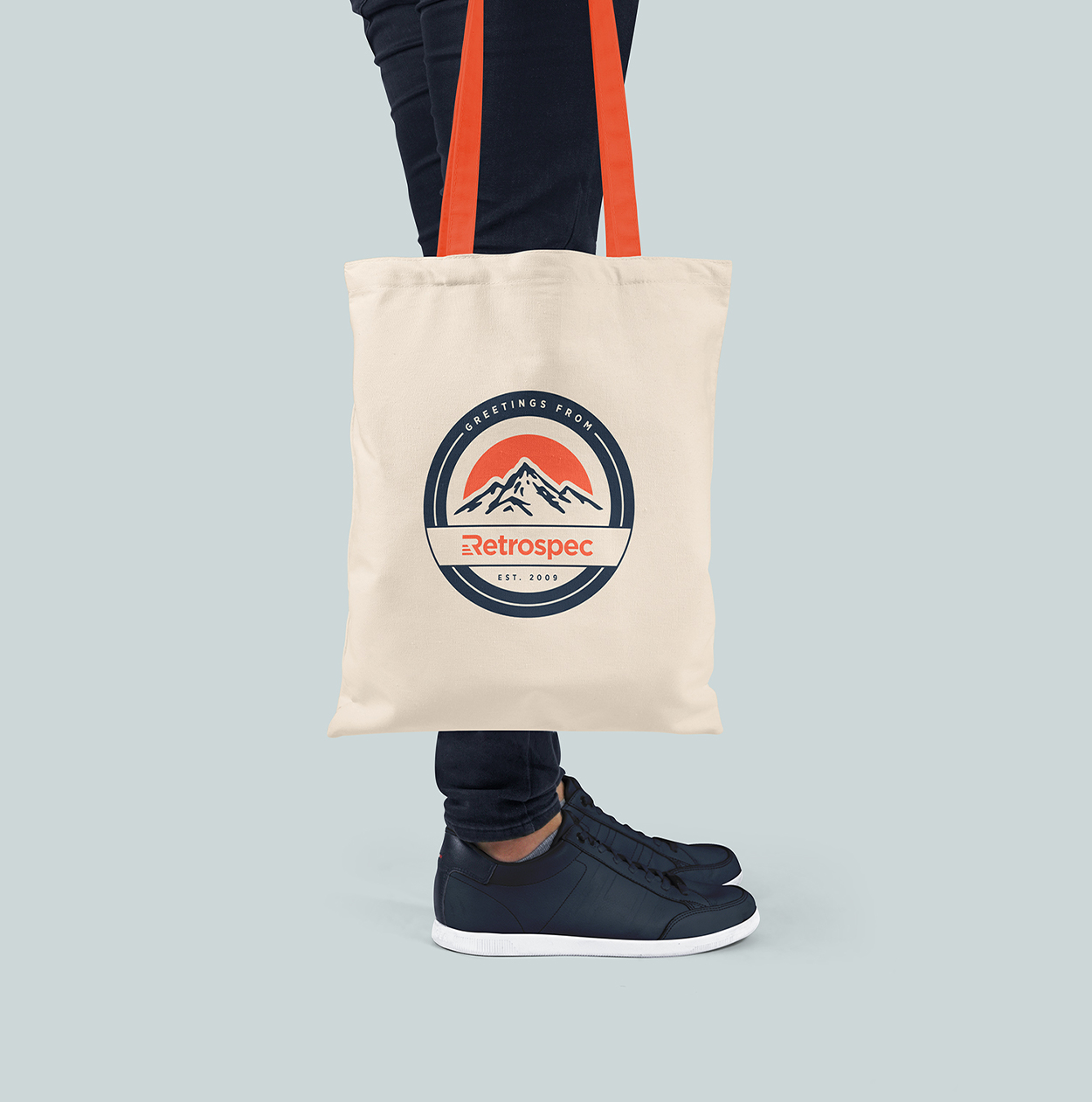
Product packaging & marketing collateral depict brand lifestyle imagery, badges & illustrations encouraging customers to explore the outdoors with their recently purchased products & share adventures via social platforms.
Brand Guide
Brand Guide
Brand Guide
Brand Guide
Brand Guide
Credits
Credits
Credits
Role: Art Direction, Identity Design, Visual Design
Lifestyle Photography: Julio Bustamante, Anders Bybjerg
Product Photography: Julio Bustamante
Selected Works

Oliver LoganBrand Identity, User Interface
Compass In-HouseBrand Identity, Visual Design
Compass Brand ExpansionBrand Identity, Visual Design
Compass — Arlen RaubachBrand Identity, Visual Design

AppleDigital Design
BudweiserBranding | Digital Design
trntblBrand Identity, User Interface, Photograpy